
Microsoft Band 2 WebSite and Phone UX Problems
Posted on: 2016-01-08
I really like my Microsoft Band 2 but there is some UX (user experience) problem that engineers and project managers need to be careful about. This post describes some actual user experience problems that Microsoft Band. The goal to highlight some common problems that are often forgotten and make the whole product look bad. The experience is often related to UI (user interface) problem and most of problems describe in this post contains easy solutions to implement. This post concentrate mostly on the web UI but some detail about the phone application and Band interface are discussed.
Three different softwares
To use your Microsoft Band you must use a website, a phone app and your band. These 3 different softwares are required for many configurations. You cannot do everything at a single place. This is not the first time Microsoft is going that compromise. If you used Microsoft Azure, this is something you are used to. Some configuration are in the new "Blade" interface, one with the old portal manager and finally some configuration are only available in the CLI (console). With Microsoft Band, it's the same thing. This is a bad user experience because you do not know what tool to use to to which task. While it's perfectly understandable that you cannot do complex operation directly into the Band, it is not comprehensive to be able to do half on the phone and half on the website.
Workout Planner
The workout planner is a good example of the problem related to the need of multiple devices and softwares. Particularly, if you want to create a new workout you must login in the website. However, you need to use your cell phone to sync the workout to your band (because you can only have 1 workout at a time) and then you need the band to activate the workout tile and to use the app. The problem is, if you are at the gym and you realize that one exercise is missing or that the number of set is not right that you are screw. You cannot edit it with your phone, neither with your band. The user experience is not good and it was definitely not oriented to people that create their own workout. You can always use your cellphone, go with a browser into the webportal, do you changes, save and synchronize. But you will still need to have to go to your phone and synchronize.
But it goes beyond that. The cellphone needs Internet to retrieve your workout. You cannot just use the website to synchronize all your workouts and then from your cellphone synchronize with the band. The cellphone needs to have an active Internet connection to be able to synchronize the workout. In fact, you cannot even go inside the workout section of the cellphone app without Internet -- it loads and close.
Problems and solutions
- 3 softwares : The cellphone and the website must provide every configurations and selection capabilities. Big, complex reports can be more enhanced on a richer platform like the website but simple editions must be on the phone and website. Bands should allow basic configuration too like changing weight, sets repetition, etc.
- Internet connection : When synchronizing workout from the website, those should be in the cellphone. From there, you should be able to do everything without any Internet connection on your phone. Editions, synchronization with the band and creation are operations that the phone doesn't need Internet. The interface needs to have an indicator to specify which operation require Internet to avoid bad surprise.
On an other subject, still related to workout planner, if you create your own workout on the website, you realize that you are sandboxed in a limited world of exercise. The UI is really nice with a slide menu with filtering and searching capability. It offers a lot of basic exercises but forget everything with machines. I am all okay with not having the web page giving all machines in the world, but the user experience is broken since you cannot add your custom exercises. That mean that you cannot add for example "Chest Press Machine". This problem wouldn't be there if the software engineer who create the exercise selector would use the application because it is almost certain that the catalog of exercise wouldn't fit everyone.
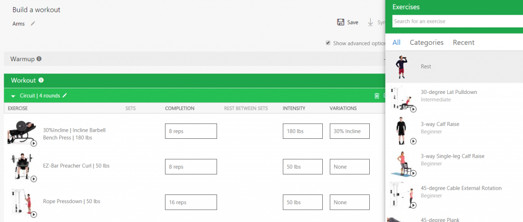
Concerning exercises selection, if you selected an exercise, this one cannot be moved to another list or circuit of your workout. This is frustrating if you have setup all sets, completion, rest information and would like to drag and drop into another circuit. The UI is also not helping since it lets you drag the exercise over the other circuit or list.
That said, the workout builder tool is not bad. You can do a lot of thing like organizing a list of exercises with repetitions and sets. You can also create circuits which are awesome! In advance mode you can even specify the inclinations of your bench. One problem is that it will display not in degree but in percentage when synchronized in your band, but this is more a bug than an annoyance. The real problem is that if you specify 100 pounds and during the exercise you do 110 that you cannot modify any weight during the training. Not with the band, not with your cell phone. You are stuck with the configuration written with the website. Changing weight during training is common and the band should let you increase or decrease the weight on the fly.
Another interface problem is on the band. If you have a long exercise name, with weight, with inclination and with other advanced setting detail that the band will not be able to display everything. You may think that you can scroll vertically to see more; but you cannot.
Finally, the workout planner is not forgiving. If you accidentally touch twice the action button the documentation said that you get out of the workout application and you can see your SMS and other tiles. However, if you click twice action not fast enough, it goes to the next exercise. There is not way to move back. A user interface must always be forgiven to the user. Why not just letting the user swipe to the left or right and select "Pause workout" instead of those tricky double click button? It is also not forgiving when you are building your workout online. You can build everything and the system doesn't save anything until you hit the save button which cause some lost of work often.
Problems and solutions
Most of these user experience issues can be fixed by.
- Lack of custom exercises : Offering the slide out menu the possibility to add a custom one and also have a category named custom where you can find later your customer exercise.
- More flexibility when configuring : Letting the user drag and dropping exercises every where in the page would be a second easy improvement.
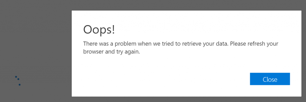
- Losing work : One more improvement would be to auto-save workout. I got some nasty bug that crashed the page and have lost in the same time my whole workout.
- Not displaying the whole exercise on the Band: Exercise that have long name and/or with advanced settings need to be like a marquee (scrolling text) instead of truncated the exercise.
- Pause : The band should have an additional slide option to easy pause a workout instead of double pressing action buttons
- Band workout set/rep adjustment : On the Band, I do not expect configuring a workout but probably be able to adjust the number of set and weight. This could also be done by just adding a new sliding window on the current exercise.
Activities
Activities have some predefined one like running, biking, golfing. You can create your own with the cellphone application (not the band, not the web site). For example, I created one for "Walk". Other than having the creation and edition limited to the cell phone, the other user interface problem is that custom activities are not present for consultation on the website under "Activities". To be able to consult, you need to go Exercise and check the history list of all exercises. This is really not obvious.
The use of activities lets you have more detail about your heartbeat because the Band will samples more frequently your pulse than the normal 1 minute sampling each 10 minutes. However, the problem remain the same in every heartbeat graph (phone or website) which is that the x-axis graph is for every 15 minutes outside exercise or 5 minutes for exercise without the possibility to zoom. The graphic is very small, hard to read and precision. The y-axis is jumping by 15 too. Another problem with graphs is that you cannot move hover to get for a specific time what was the heartbeat.
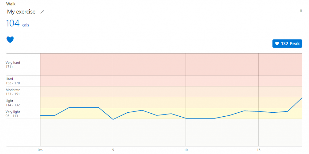
One last thing about the heartbeat graphic is that there is not way to see clearly when an exercise started or even a round of exercises. There is not way to show rests or any pause. The graphic doesn't provide any insight about anything else than looking great at a first glimpse.
Problems and solutions
- Phone only : Activities needs to be created on the website too. There is already an activities page where we can reuse to create new one.
- Custom Activities List : Activities needs to be easy to consult on the website. They should be on the left menu under pre-defined exercise.
- Graphic precision : Create graphic that you can select a period of time which will drill-in. Create better axis with more details.
It's worth mentioning that when creating a custom activity you should be able to select which sensor you want to collect too. By the sensor you choose, it's easy for the UI to select what graphics to display on the phone and website. In the same way of thinking, you the selection of sensor should have the skin temperature which is completely absent from every interfaces while being a selling marketing argument.
Financial Tile
The financial tile is fine. Of course, the configuration is limited to one device. It's configurable by the phone only and it lets you select a list of stocks. The problem is that I wanted to track USDCAN which is the currency between USA and Canada. The phone lets met select it from an autocomplete menu. This one can be sync to the band but the ticker doesn't give any value. If you try for more common ticker like MSFT, it works. This is a bug, and as a user, I still haven't really found the way to report bug for application like the financial tile.
Problems and solutions
- Phone only : Create a user interface that allows every tile to be part of the portal. An extensibility model that tile to have configuration into the portal. This way, we could configure all quotes directly from the website.
- Bad symbol : The autocomplete said that it's a valid symbol but it never fetch any values. The user needs to know what to do. Never let the user not knowing what is the next step to fix an issue.
Sleep Tracking
I was and still am a user of Zeo. Zeo is a head band that you have on your forehead during your sleep and it keeps track of your brain activity. Let me tell you that Microsoft Band is really far from being accurate. First, I do not move when I try to get to sleep. So, Microsoft Band think I am sleeping because I am also someone that go very fast with a slow heart beat. Zeo head band can give me 20 minutes while Microsoft Band will give me 10 minutes. The problem is more than that. When I sleep, I know that I have always 2 periods of deep sleep. I have been like that since years and my cycle I just not regular like we would expected. That said, Microsoft Band only find one of those two deep sleep cycle. Finally, since the last half of my night I am only in REM, I tend to move quick a bit but I am not awake. Microsoft Band records these movement has I was awake, so I have a lot of awake period. Finally, the smart alarm take so much time to kick in that I have most of the time the time to wait more than 5 minutes, eyes open before it starts. This is also probably because my heart beat remains very low until I am out of the bed. Zeo head band had also a smart wake up which was really waking me up at the right time. So I guess it works for some people, but for me it didn't and I am sad because I got a wonderful experience with Zeo head band which is now out of business.
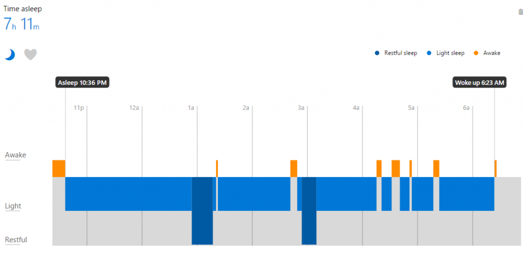
The chart is having the same problem than the heartbeat one. It's not possible to zoom or get any information while moving the cursor hover.
About sleeping, there is some sleeping configuration you can do under Action Plan. You can setup a Sleep Better plan. I still haven't found how to change the 8 hours sleep to something else. I would have like to set it up to 7h30 per night, you can't. This is awkward and make the tool frustrating because you can only slide it from the left-right without resizing the time slider. 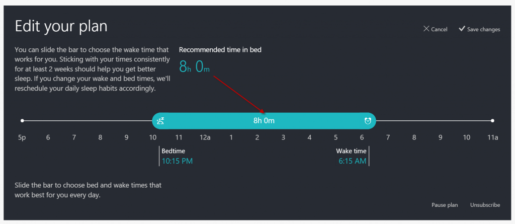
Problems and solutions
- Precision : This will never bee as accurate that the Zeo or device that use brain sensor. Nevertheless, there is a lot of work to have something that make sense or not. At this point of time, the system is really broken and work for specific type of person only. The challenge is not obvious to solve but it needs adjustment.
- Chart : Like other charts it needs to capability of zooming and being more accurate.
- Action Plan : Giving a default suggested value if fine; letting the user configure it for his life is better. The 8 hours slider should be configurable to the amount the user want to sleep.
Habits
The habit screen is new from few weeks and allows you to specify some reminder. The problem is that the way step to configure habit are located. First of all, the first experience is weird. One item is selected in Sunday. When clicking on this one, it opens a popup where you can select other days. However, you have no clue why this habit is there, neither what to do with it. It's an habit of checking your Microsoft Health. Second, clicking any empty spot (see #2) doesn't do anything. It's natural to try to see if you can add habit by clicking the timeline, but you cannot. To add a new habit, you have to click on the horizontal scrolling panel. This will open a popup and let you add a new habit. Once it's done, the third problem arise. How do you edit these habits? That time, you click the icon in the timeline. Why adding and editing is different and why do you need to go bottom-up to create habit is something that is very non-natural. Also, why using popup. Exercise used a slideout on the right side of the website which let you still see completely your workout while giving you the possibility to edit. The same design should have been kept. Not only for consistency on the website but also because it makes sense not to leave the user in an unknown state. For example, having a slide out with a list of habit that you can drag into the time line make sense. 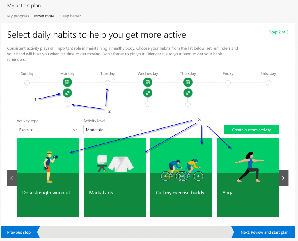
One weird habit is the light exposure that is not in the habit screen but in the sleep better. I had mind set in the morning, finally wanted to have in it the afternoon. This is what I got, a screen with a red border, without message. This is problematic because I have no clue what I am doing wrong. The solution is to show error message. After re-reading, I finally see the message on the left saying that accordingly to my plan it should be between 6:15 and 11:00. I do not understand why not in the afternoon. So I ended up by removing that habit, and just use a walk habit in the afternoon. 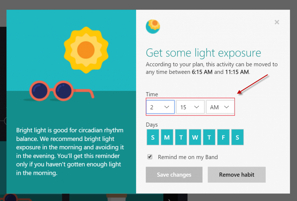
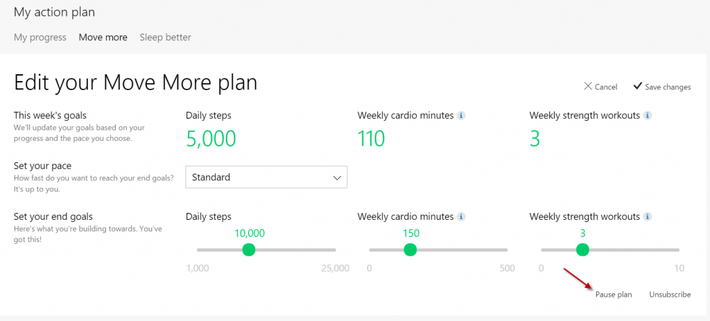
Habit can be paused but it is not obvious. You need to go in one of the plan action you want to pause and edit. The little button at the right corner is where you can pause or unsubscribe. It's hard to know what is the difference since there is not explanation. A solution to that user experience is to have instead of two little links an rectangle with a description and a button to pause/unpause, subscribe/unsubscribe. Right now, there is no easy way to know if I can subscribe back here or somewhere else. This make the user uncomfortable to try.
Battery
The battery is not that bad if you are not using the GPS. The problem is how the Microsoft Band display the battery power -- it does not. You can slide the main tile to see an icon that describe if the battery is full, half or almost drained but there is no way to get the percentage. The only way to have an accurate measurement it to plug the Band to charge this one. At that time, the Band display the right percentage. I am not using any GPS capabilities and workout for about 30 minutes with about 20 minutes walks and the battery drains to about 45% at the end of the day. Having the Band back to 99% (it never goes to 100% for me) take about 45 minutes which I do while in the shower and eating dinner.
Problems and solutions
- Battery indicator : Display to the user the percentage of the battery, display the approximate time remaining to be at 100% and if 99% is fullly charge (or not still do not know) write a message specifying that it is fully charged.
Overall
The steps counter is great, having some insight about your heart is also good. Every page of the website is lacking some polish. On a HD or 4k screen the website is not well adapted but lets note that you can resize your browser a little bit and see some responsiveness. However, the website is not phone friendly completely, more tablet friendly. The lack of zoom and the confusing UI is a bummer but still make the Microsoft Band 2 a great purchase. It's been about 3 weeks that I am using it and I have a good time with it.
Microsoft is using UserVoice to give you the possibility to vote for which features you would like the team to work on. This is great and they are still improving like they just added the possibility to control your music with your Band. The user interface is confusing on the phone and on the website. I have the feeling that both teams needed to ship something to show the data as fast as possible, and the result is what we see. The interface is lacking of options, you need to go in a lot of different places to get your data for example if you want to see your heart beat you need to go in Calories or Steps screen. Also, you will see plenty of spinners when loading graphs when it's the first time you access the data. Nevertheless, the art on the website are great. Lot of graphics, some SVG animations which are cool and most of the configuration are accompanied with great cartoon illustrations. Even if the color are not yet harmonized across the website, we see some experimentation and improvement coming in and out. The website looks alive and give the impression that they are working in the right direction to have the best experience possible. They have thought to have different view on every page depending of if you are interested to see a daily view, weekly, monthly, etc. Soon, I will try to develop with the SDK and write again my impression. I am already really exiting to see what we can do with the Microsoft Band 2.