
Improving the User Experience of a Complex Form with Animation
Posted on: 2018-08-23
I am working at Netflix on one of our website dedicated to our partners around the world to get information as well as performing actions in their caches (Netflix's CDN). One form allows to configure the BGP Configuration. It was present in the legacy portal. I found it complex to understand and while many users are well aware of how BGP works, some other partners have less knowledge. I am a strong believer that a user interface must guide the user to avoid writing bad information and then being alarmed by a red error message. My philosophy is to guide the user during the data input and make the experience enjoyable without fear of bad action or wrong inputs.
While I was learning how Netflix's caches worked and how BGP was supposed to be configured, most people were drawing a diagram. Since the "human to human" natural explanation was to use simple graphical geometrical shape to explain the concept, I decided to not fight that natural behavior and to embrace it.
The first step was to produce a simplified version of different kind of sketches I received and to generalize the idea from several different states the BGP can be configured. The configuration in the old system was two forms for IPv4 and IPv6 which required the user to have a mental picture of the configuration not displayed. I decided to combine the two to avoid the user to open two browser windows (or tabs). I also wanted to avoid a completely new form per use cases. For example, a BGP configuration requires hops between the gateway and the peer when the gateway is not on the same subnet of the peer. The peer IP is configurable, hence can change which may or not have the hops count in an instant.
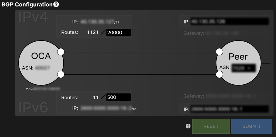
BGP Configuration with IPv4 and IPv6
The screenshot above shows a configuration. On the left is an OCA for "Open Connect Appliance" which is the cache that has all the movies. On the right is the Peer. The gateway in the IPv4 and IPv6 is on the same subnet hence does not have any additional inputs to be filled. This diagram has all the IPv4 at the top and the IPv6 at the bottom. After one or two usages, it becomes easy to see what inputs are for which internet protocol as well as for which machine (cache or peer).
Another detail is the highlight of which input or information belongs to which part of the graphic. When the mouse hovers any portion of the user interface, you can see the internet protocol being highlighted. It guides the user into knowing which element is getting changed.
Hover highlight the impact of a change
Another detail shown in the previous image is that when you activate a section, there is inline-help, a circle with a question mark, that appears. The help that does not clutter the interface and appears and the right moment allows the user to get additional information about the values. After getting telemetry in these inline-helps, I can confirm that the idea is a success. People are reading them!
Inline help that appears only when relevant
You may notice, on the first screenshot, that the reset and submit button are disabled. The inline help next to the button explains the reason to the user. When the user interacts with the form, the buttons change state and also the inline-help. The help is dynamic everywhere. It means that it's a lot more work in term of development because the messages require to be smarter but it also means that the user does not fall into the trap of generic message that does not help them -- every message is right for the user's scenario.
Gateway appears when the IP are not on the same subnet. Merge of the gateway when IPv4 and IPv6 under the same situation
In the last animation, we can see a more advanced scenario where the user interface guides the user by showing additional fields that must be entered: the hops count. The field has some business logic that indicates that it must be between 1 to 16 and the interface adapts to shows the input as well as where the information belongs. The hops are between the gateway and the peer. Also, you can see the gateway IP moving to the gateway which is not anymore the same as the Peer IP. Suddenly, anyone using the form sees that the gateway is an entity apart of the Peer and that it has an IP that cannot be changed, but the Peer IP can.
You may wonder how it was built? It was built using React, TypeScript and basic normal HTML. No SVG, no canvas. Working with SVG is trendy but it overly complex for even basic styling. For example, adding a drop shadow. It is also more complex to meddle with input fields. Using DIV and Inputs did the job perfectly.
I already wrote about how to handle Animation with React, and the exact same technic is used. CSS3 animations conduct animations. Many more scenarios require parts to move, and every dance is orchestrated by the main form component and children components that add styles and CSS classes depending on every property that describes the business logic rules.
The graphic is wide and on small resolution could be a problem. I decided to fallback to a simple basic form with label on top of the inputs. Nothing flashy, but enough to have someone in a small tablet or a phone to be able to configure the BGP.
To conclude, the animation is a step into a more complex and fancy vision I had. Like I wrote in the performance article, I never had a dedicated task (or time) reserved to make this feature with animation -- I had to do it. The more I work in software engineering, the more I realized that it is very rare that you have time for extra. This unfortunate rule applied for user interface extra, for performance tweaks and even for automated tests. You must find the time, squeeze these little extra between bigger initiative and always have some buffers for issues which could be used if everything went smooth into some polishing. In the next bug fix, I plan to improve the colors and how smooth the animation happen on slower computer, but this is story for another time.