The bad habit of hiding features with context menu and double click
Posted on: 2016-02-29
Once in a while, I feel that some subjects return on the table wherever I go. One of that subject is where should we but a button to launch a specific action. While this is totally a valid question, the repeated problem is that at some point in the conversation people focus on the easiest way to do it instead of the best way to do it. Of course, the best way is always subjective, but the wrong way is normally accepted by more people.
Let's start with some premises. No one can argue that an hidden feature is a bad. First of all, the name says it: it's hidden. Users will not find it easily, thus not use a feature that cost money to the company to create. This can be even more drastic than that, people may just leave your product because they cannot find how to do specific action -- the software is slowing the user down, make him frustrated. Worse, when evaluating a product, this can be a turn off because the user will not even notice that your product has that feature compared to your competitor which has the feature in the face of the user. Second, an hidden feature make a occasional users forget about it. Even if it was written in a documentation, the user will forget about it and not use it. On the other hand, if this one is clear in your user interface, there is a bigger chance of re-learning to use the feature because it was in a natural place, a visual place.
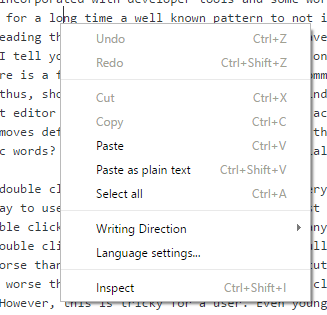
This lead me to two principles in Web Design that are wrong. The first one is the right click to have a context menu and the second is the double click event. Right clicking was something that developer high-jacked in the late 90' to block people looking at the source code (Html, JavaScript) of a website. Some people were displaying an alert window saying that the source is not available. That trend didn't last very long since browser got more and more incorporated with developer tools and some work around was possible. It was also very annoying because no default right click menu was present. Users couldn't

The double click on Web Site also comes from Windows Application paradigms where you can double click a folder to open it and from very popular software like Outlook. However, double clicking in web were not supported until the last few years. While some limited use cases may be okay to use double clicking, it is not for most scenarios. Double clicking shares some problems with context menu -- it's hidden. On this website, can you tell me which Html element you can double click? Of course, you can double click any word to have this one selected : like expected on any reading or writing text software, but other than that? It is impossible to know. Can you double click the "Build Status" to get the full report? Can you double click a user name in Facebook to have this one added to your friend list? No and no. In fact, double clicking is even worse than the context menu because once executed in trial-and-error the action is executed. At least with the context menu, you could see the hidden feature before triggered it. It is also worse than the context menu because double clicking depends of the speed of the user to double click. It's not for nothing that you can configure the double clicking rate in all PC settings. However, this is tricky for a user. Even young software engineer in good health can sometime not double click at the right rate, hence clicking twice. Double clicking is sneaky, because if you single click twice fast you trigger the double click event. If you single click twice slow, you trigger twice the single click event.
The solution of both of these hidden features is to think to a good design. You can most of the time create button to do actions. You have a group of action, than you can create a toolbar or you can create a button with a dropdown of action. You needs to have something big in a very tight space; click to expand that space to let you do more and than contract that space.
